Creating illustrations
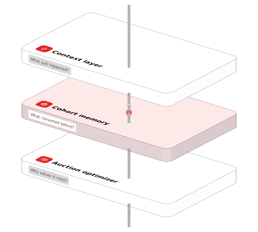
Every rule on this page is shown on a picture the library drew. An illustration is made from the library’s objects, by these rules, and a picture that needs an object the library lacks starts with a request: Asking for a new illustration.
Fill and highlight
Section titled “Fill and highlight”White objects with one thin dark outline; colour appears only as small flat details and tints, and every colour is a token. A highlighted surface takes its colour’s 100 tint, and a badge on it turns color/neutral/0 so it keeps its contrast. Only a screen takes a screen’s colour. No object casts a shadow: a picture stands on the page’s own ground, with nothing drawn under it.
| Token | In CSS | Value |
|---|---|---|
illustration/shell |
--pui-illustration-shell |
#ffffff |
illustration/surface |
--pui-illustration-surface |
#f2f2f7 |
illustration/detail |
--pui-illustration-detail |
#dad9d9 |
illustration/screen |
--pui-illustration-screen |
#fbfbfd |
illustration/deck |
--pui-illustration-deck |
#ffffff |
Outline
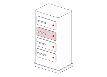
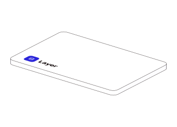
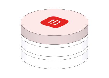
Section titled “Outline”One thin dark line, the same on every object. Every rounded solid draws the line along its rounded edges — a plate, a card, a disc, a phone, a laptop, a TV, and the pedestal under a device. Fully round objects do draw the line where their side turns away, or they would have no side outline at all.
| Token | In CSS | Value |
|---|---|---|
illustration/outline/color |
--pui-illustration-outline-color |
#0b0202 |
illustration/outline/opacity |
--pui-illustration-outline-opacity |
0.85 |
illustration/outline/width |
--pui-illustration-outline-width |
0.5 |
Shapes
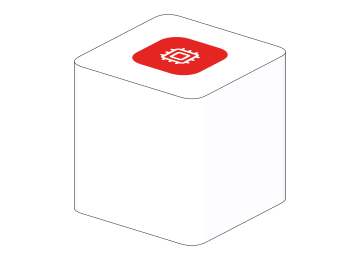
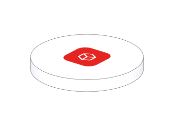
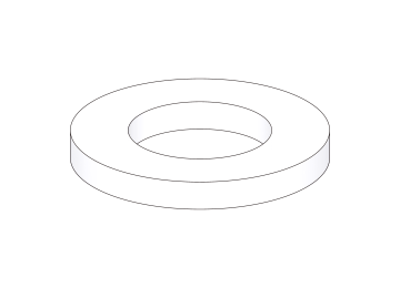
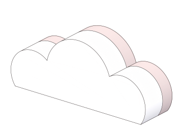
Section titled “Shapes”Every object is built from shared building blocks, and a scene is composed from objects — a simple object and an intricate one are made the same way, so they take the same light, the same outline and the same camera.
Colour: one, or the three
Section titled “Colour: one, or the three”An illustration is one system colour or the three — never a colour outside the system. When a picture needs one colour it uses one of the system’s, red by default; when it needs several they are the system’s three — red, yellow and blue, each with its own steps. The request for a picture says which. Green has three steps and is not an illustration colour.
A deck, a page or a dashboard uses all three. A picture inside one is the smaller thing: an illustration may be one when the picture needs one.
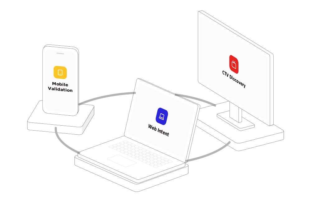
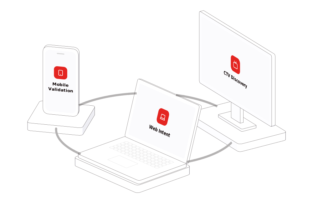
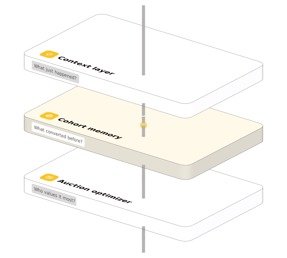
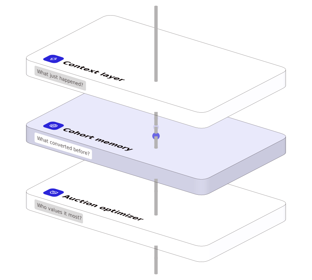
A colour is its ramp’s steps, never a value of its own: the icon tile is the 400, a highlight and a lit target the 100, the signal the 300 and the 200. In the three, a scene gives its coloured objects the three in reading order, a target lights up in its own colour’s 100 tint, and the signal takes the palette’s first colour, red.
Camera and composition
Section titled “Camera and composition”One camera direction for everything, so objects always fit together; scenes are laid out along the screen’s own axes, not along world x and z. That is why any object can stand beside any other: these three were never drawn together.
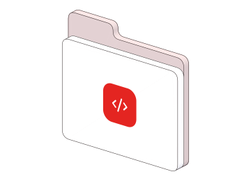
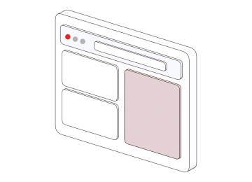
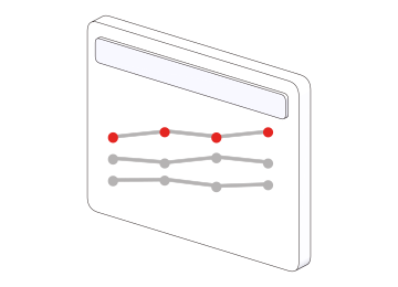
A composition is approved as a whole. A scene that reads wrong is taken out rather than kept as a sample, because a sample is what gets copied: the library holds only approved compositions.
Arrows
Section titled “Arrows”An arrow is flat — a constant-width stroke, round ends and joins, an open chevron head — and grey by default, another token colour only for emphasis. Each arrow is one smooth arc or Bezier — no hooks, no corners joined by straight runs. It starts on the source’s vertical centre line, on the face it leaves through, and ends clear of its target (trimmed to a 16 px gap); it crosses no other object’s outline, because crossings make the picture noisy. Bends are never tighter than 16 px on screen.
| Token | In CSS | Value |
|---|---|---|
illustration/arrow/color |
--pui-illustration-arrow-color |
#6c6666 |
illustration/arrow/width |
--pui-illustration-arrow-width |
3 |
illustration/arrow/head/length |
--pui-illustration-arrow-head-length |
5 |
illustration/arrow/head/angle |
--pui-illustration-arrow-head-angle |
40 |
illustration/connector/color |
--pui-illustration-connector-color |
#b5b3b3 |
illustration/connector/radius |
--pui-illustration-connector-radius |
0.028 |
Content: labels, badges, icons
Section titled “Content: labels, badges, icons”- Words are Poppins, and they stay text in the still, so a slide can be searched and read aloud.
- A badge is the system’s own. A badge is the system’s neutral Badge (
tint/neutral, radius 4, space 4 / 8, 14 Regular, line-height 1.4, no border). - An icon is the system’s own. Icons come from the system’s icon set as a colour tile with a white glyph; text is Poppins.
- The words are the slide’s or the page’s own, and a sample never names a real company.
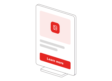
The slide under Fill and highlight carries all three on every layer: a label, a badge and an icon tile. An object carries them too.
Motion
Section titled “Motion”Live, every picture moves the same way: a slow idle drift and a pointer turn on a soft spring; the signal is a trail of three spheres in the colour’s 300 and 200 steps; a target lights up in the colour’s 100 tint as the signal arrives; with reduced motion the still is shown.
A scene is a description
Section titled “A scene is a description”A scene is a description: plain data that says which library objects stand where, what they carry and which arrows run between them. Whoever composes a scene writes the description; the stage, the one camera, the lights, the outlines, the palette and the arrow rules are the library’s. So a scene that reads correctly as data also draws correctly, live and still, and nothing in it is drawn by hand.
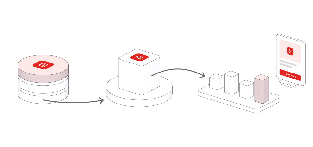
This is the whole of the data flow above — every object, where it stands, the colour it takes, and its two arrows:
{ "format": 1, "title": "A data flow: storage, processing, results", "size": [1000, 470], "palette": "red", "axes": "world", "fit": 0.05, "objects": [ {"id": "storage", "object": "storage", "at": [-2.4, 0, 1.5], "radius": 0.8, "tinted": true, "icon": "storage", "colour": 0}, {"id": "platform", "object": "disc", "at": [0, 0, -0.35], "radius": 1.05, "t": 0.24, "colour": 1}, {"id": "block", "object": "block", "on": "platform", "at": [0, 0.24, 0], "size": 1, "icon": "cpu", "colour": 1}, {"id": "bars", "object": "bars", "at": [2.7, 0, -2.0], "values": [0.35, 0.6, 0.45, 0.8], "w": 2.4, "d": 1.3, "bar": 0.34, "tinted": true, "colour": 2}, {"id": "card", "object": "card", "at": [3.3, 0, -3.9], "w": 1.1, "h": 1.5, "colour": 3} ], "arrows": [ {"id": "path", "from": {"of": "storage", "at": [0, 0.13, 0], "viewer": 0.8}, "to": {"of": "platform", "at": [0, 0.13, 0]}, "dip": 1.1}, {"id": "arc", "from": {"of": "block", "at": [0.5, 0.5, 0]}, "to": [1.75, 0.45, -1.75], "lift": 0.6} ], "motion": {"signal": ["path", "arc"], "lights": ["platform", "bars"]}}- An object has a name of its own, the library object it is, the place it stands and what it carries: an icon, a tint, words. What each object takes is on All illustrations.
colouris which of the palette’s colours the object takes, never a colour: drawn in one colour, every object takes that one.- An arrow joins two objects. The library picks the face it leaves through and stops it clear of its target.
- Data on an arrow is the signal. Data flowing along an arrow is shown by the signal and by nothing else: a trail of three spheres in the colour’s 300 and 200 steps, resting on the arrow in the still and running along it live. The signal is one library component. A scene says where a signal runs and in which colour, never how it looks or how fast it goes.
- A signal is the colour of its source. A signal takes the colour of the object it comes from: a blue source sends a blue signal, a red one a red signal. It is the default, so nobody composing a scene has to think about it.
- An object that stands on a platform stands in its centre.
- A name stands upright. Words on a standing face read far better than words lying flat. A plate that is only a name — a source, a channel, an item of a list — stands upright, its label and badge on its face; a plate lies flat only when it is a platform: something stands on it, or it is the step the flow passes through.
- What is wrong is said in plain words: an object the library does not have, two objects in one place, an arrow that crosses an outline or bends tighter than 16 px.
- A new scene is composed from the library’s objects and joins the library once it is approved.
Composed for its shape
Section titled “Composed for its shape”- The shape comes first: whether the picture is square, portrait or landscape, approximately, because a row of objects, a column and a cluster are different compositions of the same objects.
- The library lays it out. A description that places none of its objects is laid out by the library, in the order its objects are listed, for the picture’s shape: a row across a landscape, a zig-zag down a portrait or a square. An object and what stands on it are one mass. Objects are placed by hand only when a picture is not one chain: a branch, a column of sources, a cluster.
- Objects lead, arrows serve. An arrow shows a direction; it is never the largest thing in a picture. It is measured by the space it crosses: the empty stretch on screen between the two masses it joins, along the line between them, against the larger of the two; when that space is too wide, the library says the arrow leads the picture.
- An arrow that runs down the picture leaves its source at the foot, on the side turned toward its target, so it never crosses its source’s own face.
A screen, a close-up, and which way it faces
Section titled “A screen, a close-up, and which way it faces”- A device’s screen can show the system’s own page. A phone, a laptop or a TV takes a
screenin place of its label and icon — an eyebrow, a heading, a line of copy, grey lines that stand for copy, a button, an icon, a card — set in the device’s own type, colours and spacing, every word text in the still. A phone shows the mobile page, a laptop and a TV the desktop one;"dark": trueputs it on the system’s dark ground. Only the words are written; everything else is the system’s. - A picture of a screen is the exception, for what the system does not build — an advertisement, a product screenshot:
{ "image": its address }, raster in, raster out, and the scene says so. - A screen that shows a page reads only when the device is shown large: a picture of one or two devices. A close-up needs no word: held that near, the picture draws its outlines, arrows and signal as thick against the objects as the library’s own scenes do.
- Which way it faces. A picture faces left, and
"direction": "right"is for one that sits to the left of its words, so it faces them: every object turns its front the other way, the layout on screen stays where it was, a flow still reads from left to right, and nothing is mirrored. A picture whose parts are placed by hand round one object, where the side a part sticks out of is the picture, can say"mirror": true: facing right, what standsonanother object stands on its other side, so the picture is the mirror image of its left-facing self.
Two phones, each showing a page:
{ "title": "A moment is detected on the phone; a sponsored ride offer follows", "size": "square", "palette": "blue", "objects": [ { "id": "moment", "object": "phone", "at": [ -0.53, 0, 0 ], "screen": { "ui": [ { "card": [ { "eyebrow": "Moment detected" }, { "heading": "You just finished a call. Need a ride?" } ] }, { "button": "Continue" } ] } }, { "id": "offer", "object": "phone", "at": [ 0.53, 0, 0 ], "screen": { "dark": true, "ui": [ { "eyebrow": "Sponsored" }, { "heading": "Need a ride?" }, { "body": "You just hung up. Your next move is already clear." }, { "button": "Get a ride" } ] } } ], "arrows": [ { "id": "serve", "from": "moment", "to": "offer", "signal": true } ], "motion": { "signal": [ "serve" ] }}Asking for a new illustration
Section titled “Asking for a new illustration”Ask through the request path on Contributing. Send:
- what the picture is for — a slide, a section of the site, a PDF;
- a sketch, a screenshot or a reference picture — a reference shows what the objects are, never how they look;
- the words on it;
- one colour or the three, when it matters.
What comes back is the picture in both forms: a still for the slide — an SVG and a PNG at 2× — and the live version for the web. It joins All illustrations, so the next picture can use its objects, and a page places it by its name — how, on Exporting.

Pepper UI v1.5.0
The Mobupps design system. 386 tokens, 88 components, 65 pages in the workshop — every page of this site generated from the repository, so nothing here is typed twice.