Social
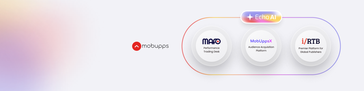
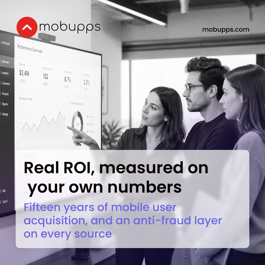
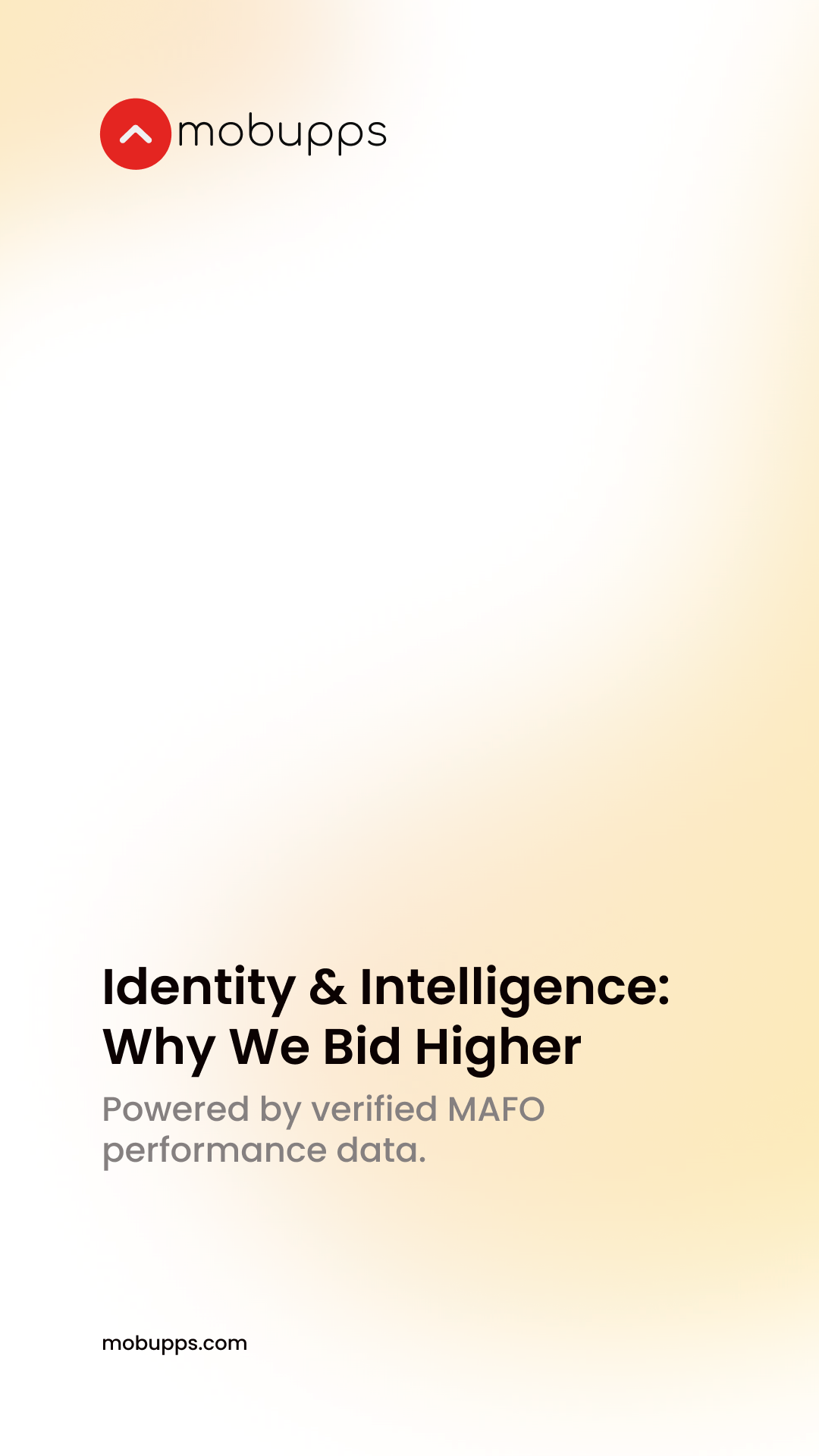
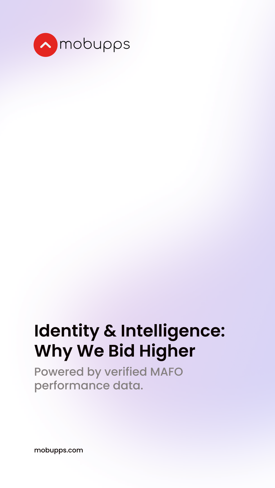
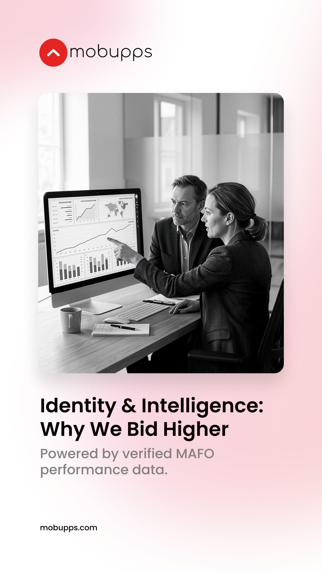
Nineteen templates, at the sizes the platforms ask for — four LinkedIn covers · two YouTube covers · three link posts · seven square posts · three stories — designed in the design system’s own file, every colour, type size and space on them a token of the system, and shown here as the file’s own export at each platform’s real pixel size. The page shows the artwork itself — click a banner to see it at full size. To make one of your own, take the editable frame from Figma: the link under each banner opens that frame — how it works.
LinkedIn covers
Section titled “LinkedIn covers”1420 × 355 — the company page’s banner.
YouTube covers
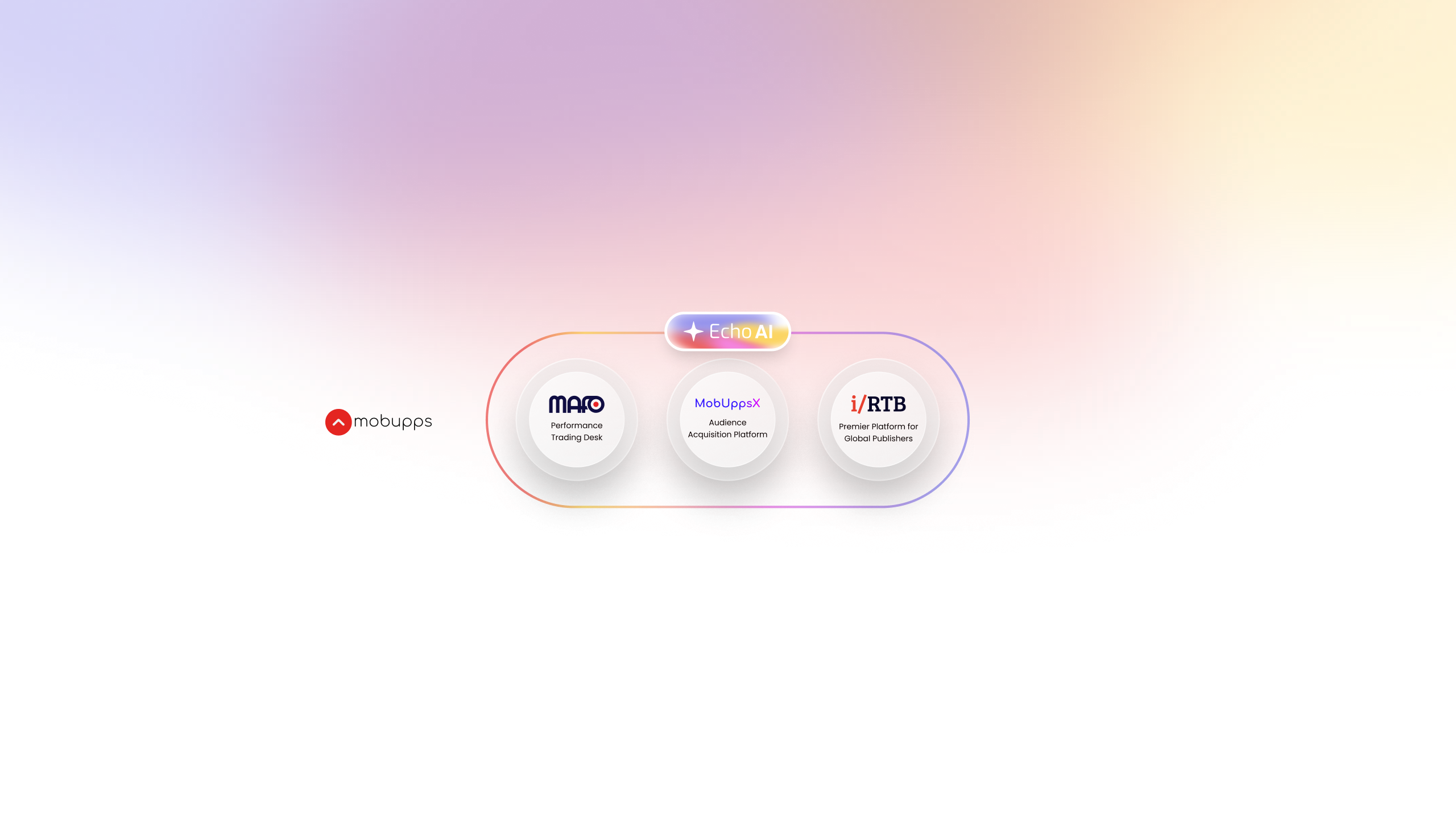
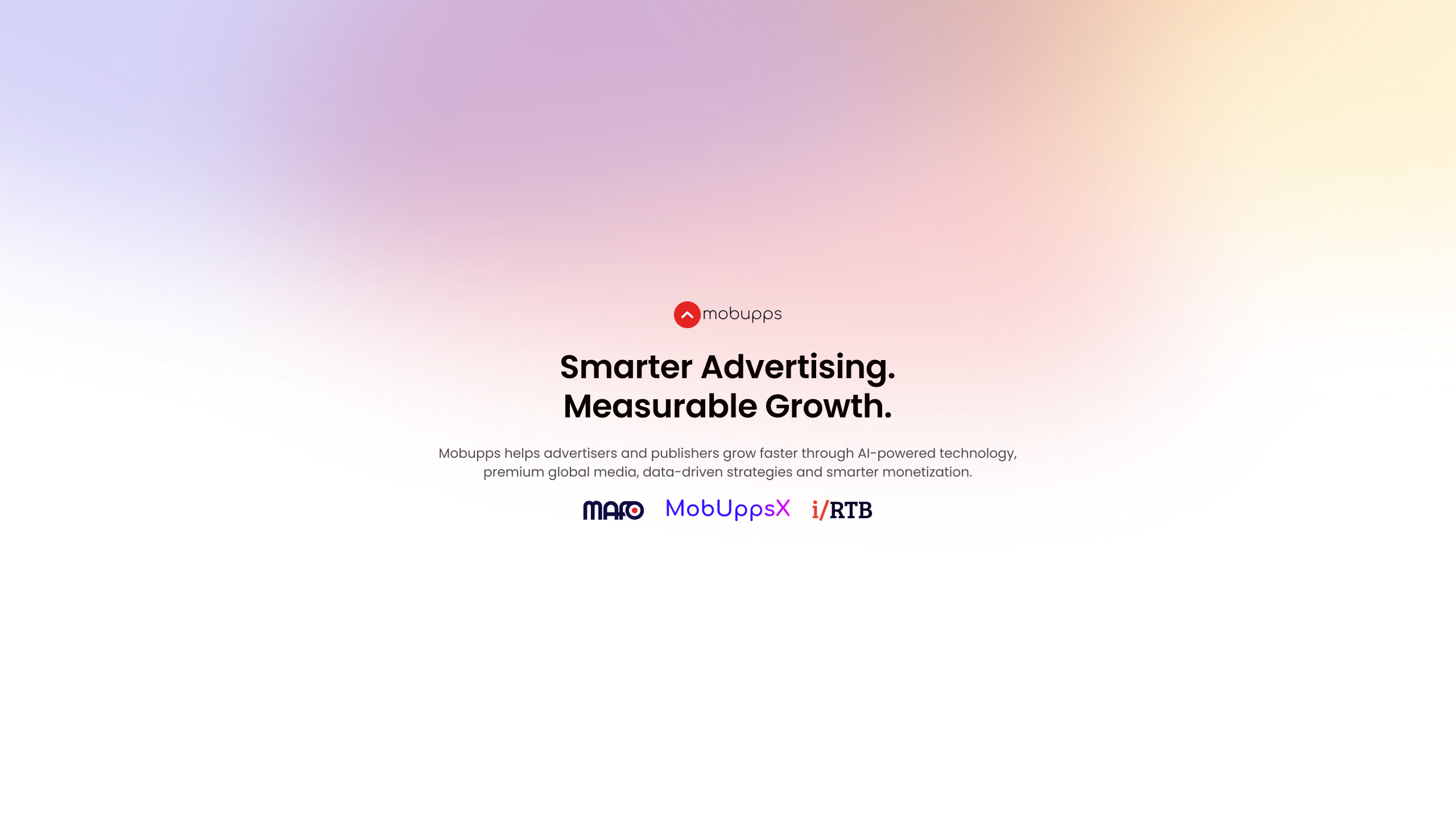
Section titled “YouTube covers”2560 × 1440 — the channel’s banner — the platform crops it hard, so what must be read sits in the middle band.
Link posts
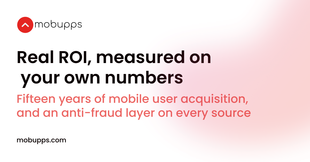
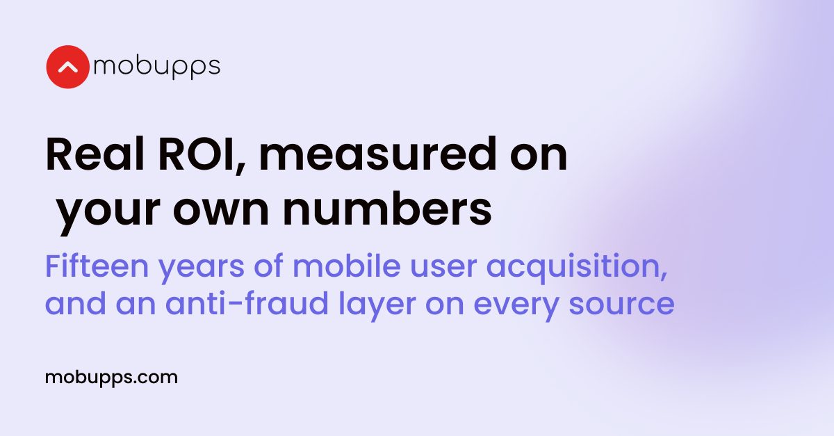
Section titled “Link posts”1200 × 627 — LinkedIn, X and Facebook, when the post carries a link.

Square posts
Section titled “Square posts”1080 × 1080 — Instagram and LinkedIn — the one that fills a phone feed.
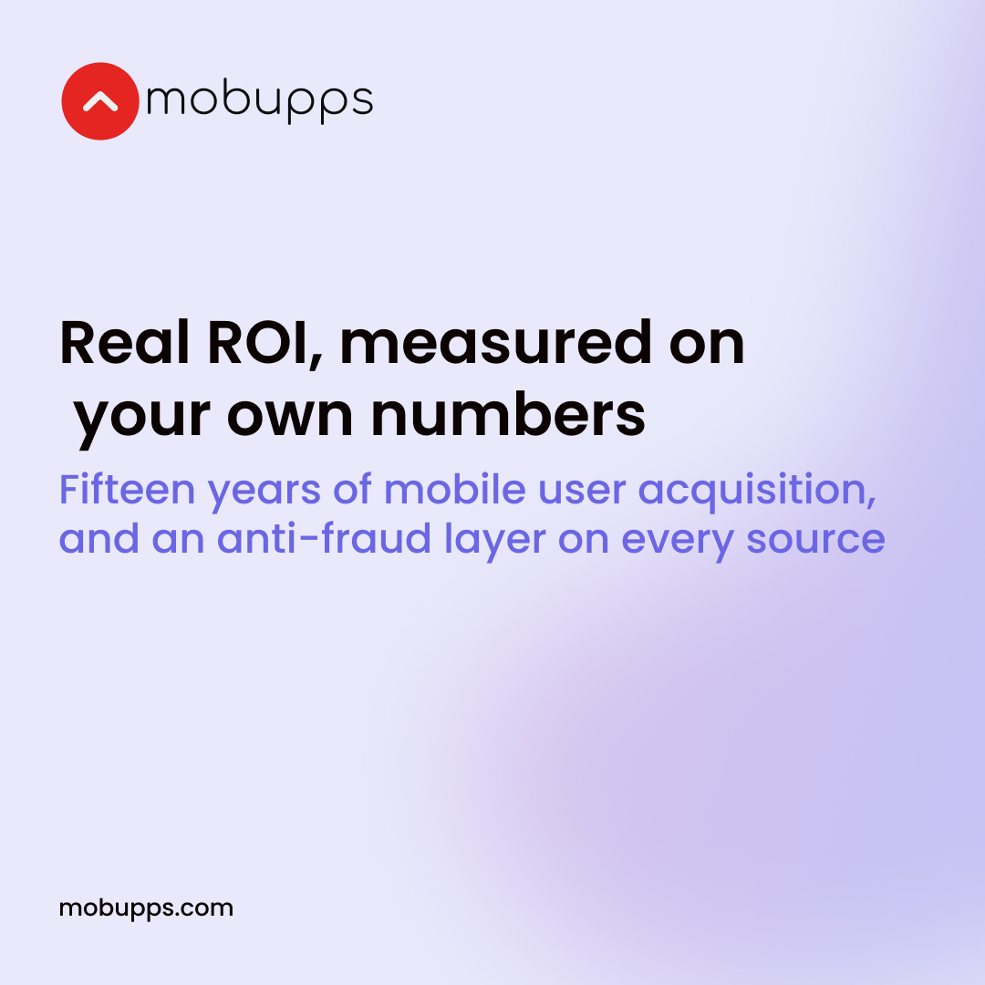
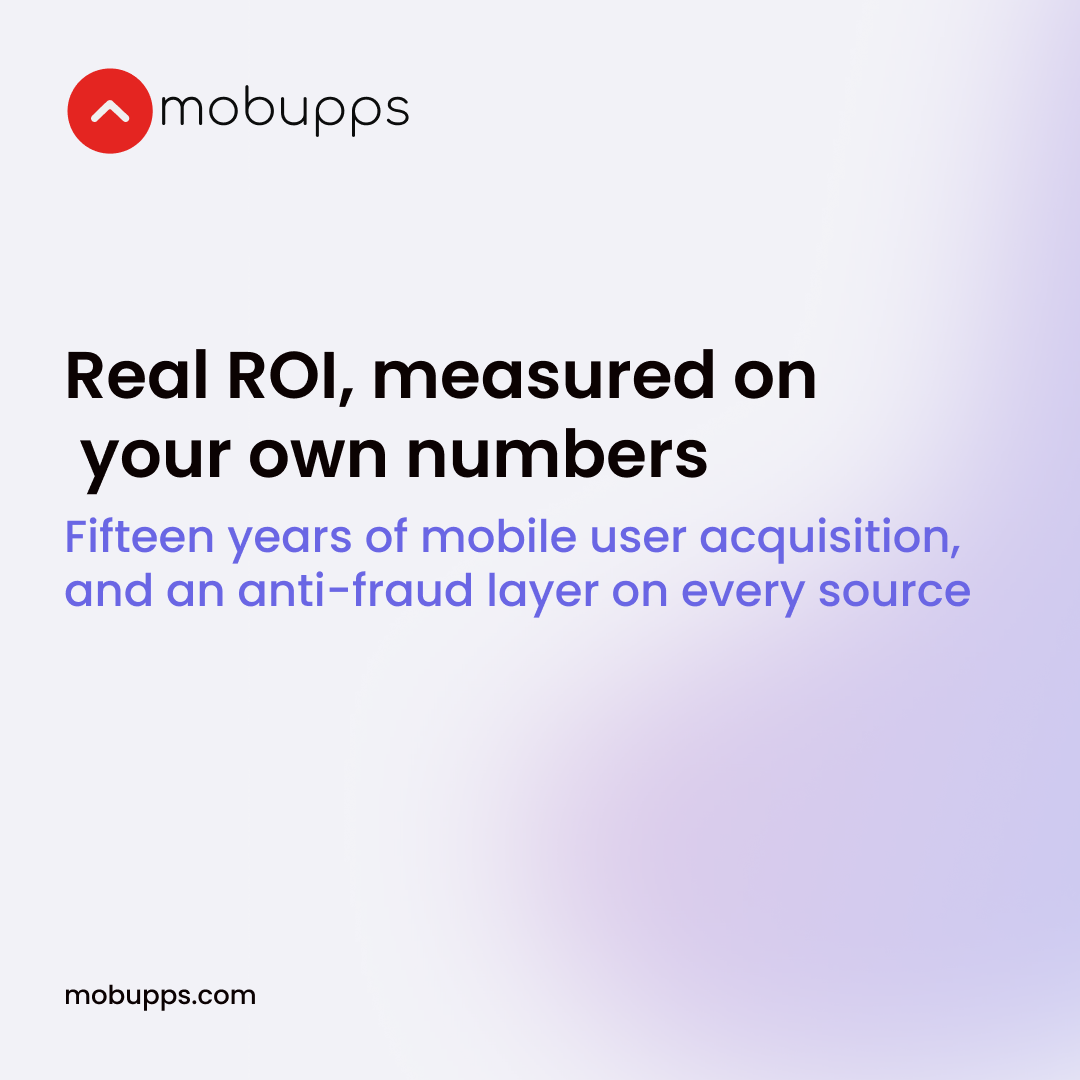
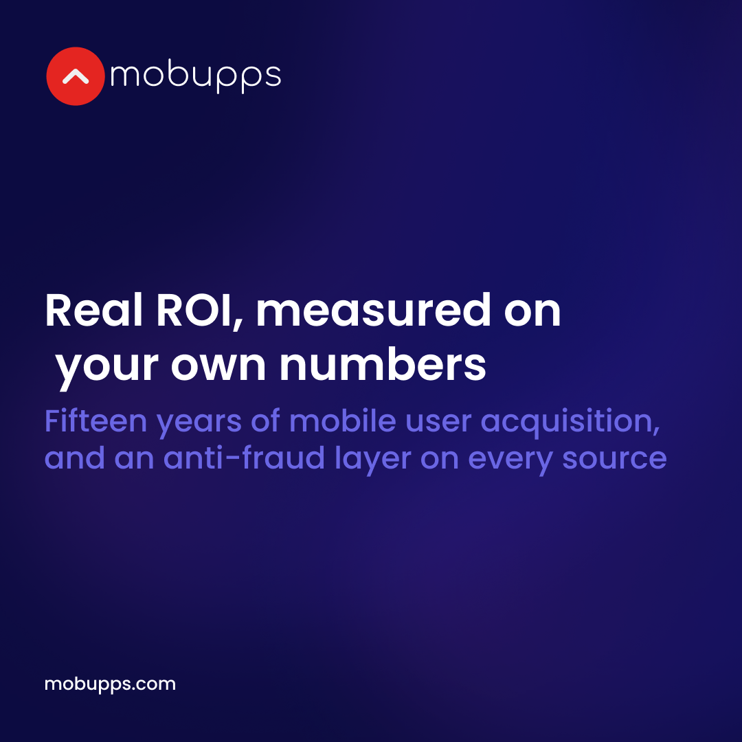
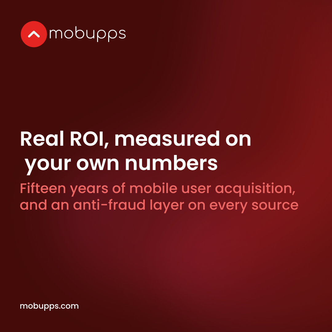


Stories
Section titled “Stories”1080 × 1920 — Instagram and LinkedIn stories, full screen and vertical.
What is on a template
Section titled “What is on a template”- One ground and one accent. Each template is set to one accent — blue, red or yellow — and its ground is a surface token; a wash on it is the library’s own Blob in the accent its designer chose, and a cover’s glow is the library’s Cover highlight.
- The heading is the component. The title and the line under it are the system’s Heading pair on the slide canvas, so the sizes are the component’s own; a small line such as the address is a type role.
- The marks are the brand’s own — the Mobupps mark, and on the product covers the MAFO, MobuppsX, i/RTB and Echo AI marks — placed at the size the frame gives them, never redrawn.
- A photograph sits in an image slot, on the card radius with the modal shadow.
- Every value is a token, and a check holds the file to it. A colour, a type role, a space, a radius, an effect on any of these frames is the system’s; the few numbers that are no token — the artwork’s own blur on a wash, a glass card’s shadow, five small text sizes, a hairline’s weight, a wash’s opacity — are listed, so a new one fails the build.
What each one is for
Section titled “What each one is for”| Format | Size | Where it fits |
|---|---|---|
| LinkedIn covers (4) | 1420 × 355 | the company page’s banner |
| YouTube covers (2) | 2560 × 1440 | the channel’s banner — the platform crops it hard, so what must be read sits in the middle band |
| Link posts (3) | 1200 × 627 | LinkedIn, X and Facebook, when the post carries a link |
| Square posts (7) | 1080 × 1080 | Instagram and LinkedIn — the one that fills a phone feed |
| Stories (3) | 1080 × 1920 | Instagram and LinkedIn stories, full screen and vertical |
Editable versions
Section titled “Editable versions”The pictures on this page are for looking at. The editable frames — all nineteen — are on the Social page of the Pepper UI Figma file: open the Social page in Figma.
- Open the page and select the frame you need — under each banner above is its name in the Figma file (
linkedin01,story03…), and the name opens that very frame. - Copy it, and paste it into a Figma file of your own.
- Edit the copy there — the words, the photograph — and export it at the frame’s own size, which is the platform’s.
If Figma asks you to request access to the file, ask the design lead.
When a post needs something these do not cover
Section titled “When a post needs something these do not cover”A one-off — an event, a launch, a campaign with its own artwork — is a design job rather than a template, and it starts from these rather than from a blank canvas: the same ground, the same accent, the same heading and mark. Ask for it through the request path on Contributing, and say which template it is nearest to.

Pepper UI v1.5.0
The Mobupps design system. 386 tokens, 88 components, 65 pages in the workshop — every page of this site generated from the repository, so nothing here is typed twice.