Illustration fundamentals
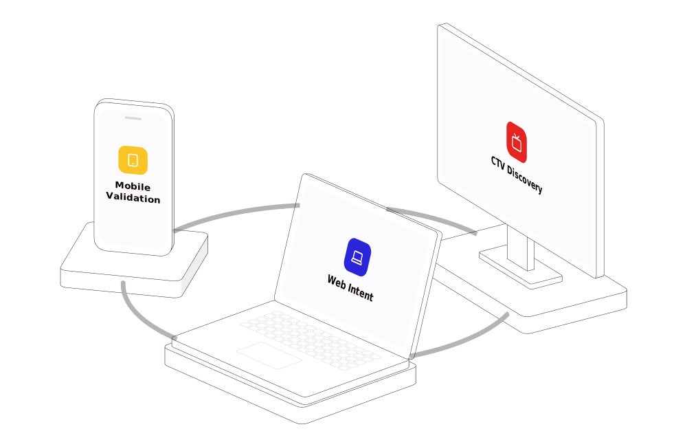
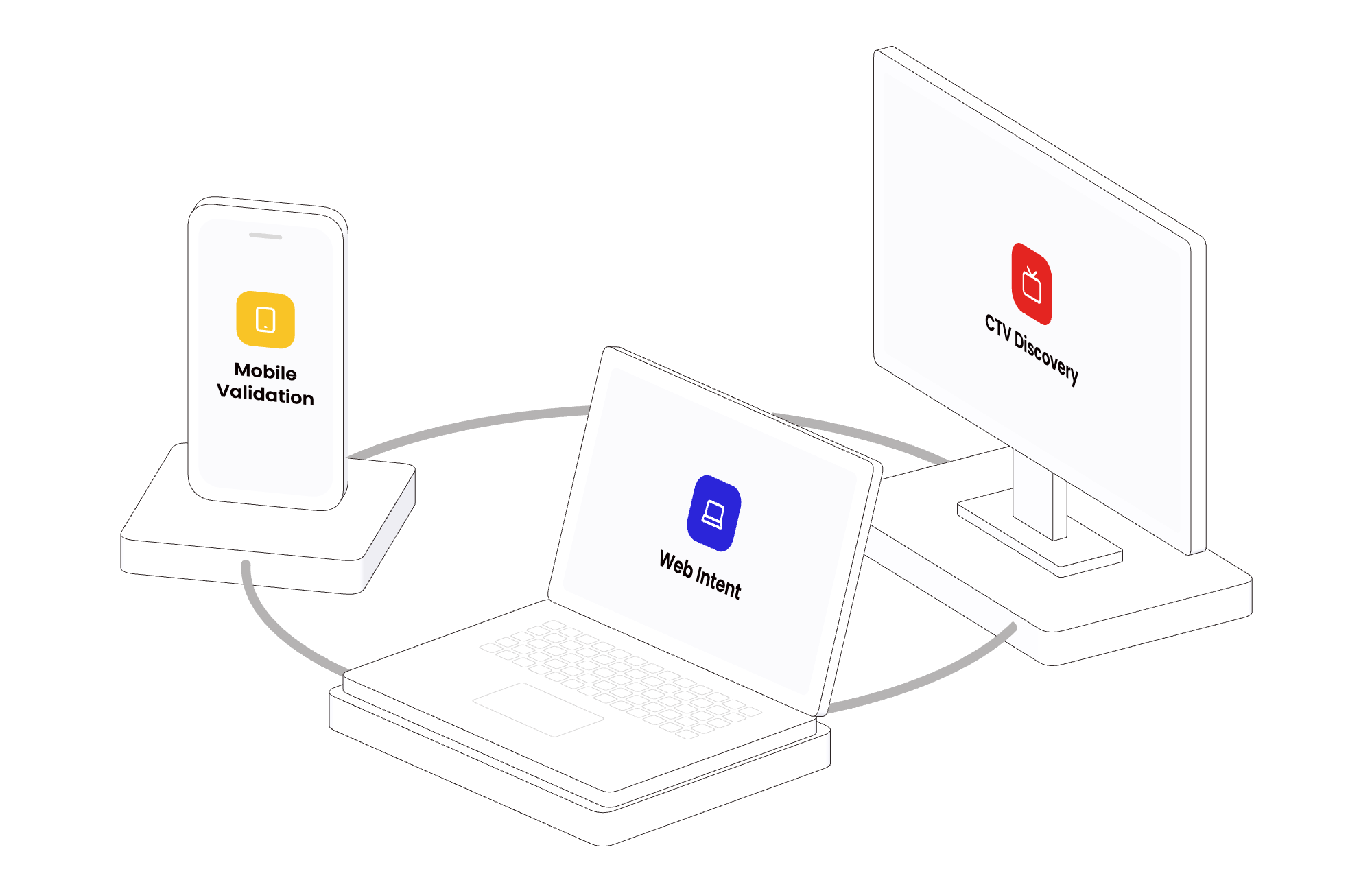
An illustration shows how something works — screens on one network, the layers of a platform, a flow from storage to a result — in a slide, on a page of the site or in a PDF. A library of isometric 3D objects built once from shared building blocks and composed into scenes; nothing is drawn by hand. Today it holds 31 objects and fifteen scenes, all on All illustrations.
Two forms, one definition
Section titled “Two forms, one definition”Every picture is one definition drawn two ways — live on the web, still for slides and PDFs.
- Live, on the web: a slow idle drift, the pointer turns it, a signal runs along its arrows.
- Still, for a slide or a PDF: an SVG — text kept as text, Poppins embedded when it is placed as an image — with a PNG at 2×.
Neither is a copy of the other, so they cannot drift apart: a change to the definition changes both.
Principles
Section titled “Principles”- One look. White objects with one thin dark outline; colour appears only as small flat details and tints, and every colour is a token.
- The system’s colours, and no other. An illustration is one system colour or the three — never a colour outside the system.
- One camera. One camera direction for everything, so objects always fit together.
- Built, never drawn. An object is built once and a scene is composed from objects; the library holds only approved compositions.
- The picture follows the tokens. The line widths are tokens like the colours: change one, rebuild, and every illustration’s lines change, live and still.
Each of these is shown on a real picture on Creating.
Efficiency and reuse
Section titled “Efficiency and reuse”The phone, the laptop and the TV are three of the library’s 31 objects. The cross-screen scene above is those three, each on a pedestal, joined by a ring — no part of it was made for that scene alone. An object takes options — what its screen shows, which part is tinted, how many bays a rack has — so one object serves many pictures.
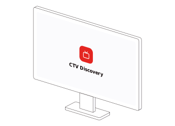
So a new picture starts in the directory, not on a blank canvas: look for the objects it needs in All illustrations, and ask for a new object only when none of them is it.
A still is a vector, so it takes any size; these are the sizes the files are drawn at.
| Picture | The SVG | The PNG at 2× |
|---|---|---|
| Cross-screen: TV, phone and laptop on a ring | 1000 × 640 | 2000 × 1280 |
| Three layers of intelligence (a slide) | 1000 × 900 | 2000 × 1800 |
| A data flow: storage, processing, results | 1000 × 470 | 2000 × 940 |
| Infrastructure: a server rack and a cloud | 1000 × 560 | 2000 × 1120 |
| Release: code, secured, released | 1000 × 520 | 2000 × 1040 |
| Two phones, each showing a page | 1000 × 1000 | 2000 × 2000 |
| Spend follows the booking window | 1000 × 720 | 2000 × 1440 |
| City by city: pins with a radar ping on a folded map | 1000 × 720 | 2000 × 1440 |
| Creative that shows the rate: cards in rotation | 1000 × 720 | 2000 × 1440 |
| Cross-screen, held close: TV, phone and laptop on a ring | 1000 × 687 | 2000 × 1374 |
| The ad opens the app on the search it promised | 1000 × 720 | 2000 × 1440 |
| Booking demand by city, on a split-flap board | 1000 × 761 | 2000 × 1522 |
| Net new bookers: markets with spend against the holdout | 1000 × 720 | 2000 × 1440 |
| Many events, one paid for: the booking | 1000 × 720 | 2000 × 1440 |
| MAFO backs every source into a target cost | 1000 × 720 | 2000 × 1440 |
| An object alone | 360 × 260 | 720 × 520 |
The outline is thin on purpose, and it stays thin at every size: illustration/outline/width is the width in px of a still at its own size — 0.5 today — and a still placed larger scales its lines with the picture. The live version draws the same line at the size it is shown, and never under one device pixel.
In code
Section titled “In code”One element draws a scene live on any page:
<pepper-illustration scene="cross-screen" palette="red" label="One user across three screens"></pepper-illustration><script src="node_modules/@pepperui/illustrations/dist/pepper-illustration.js"></script>| Attribute | What it takes |
|---|---|
scene |
a library scene, by its name — cross-screen · intelligence · flow · infra · release · screens · booking-window · city-map · creative-rotation · cross-screen-close · deep-link · demand-board · geo-holdout · one-event · source-pricing |
object |
one library object alone, by its name, in place of a scene — see All illustrations |
palette |
red · yellow · blue · three — the scene’s own without it; the three for an object alone |
direction |
left · right — which way the objects face; the scene’s own without it; left for an object alone |
still |
present: the still, drawn at build time — no engine, no motion |
idle |
on · off — the slow drift on its own; on without it |
interactive |
on · off — the pointer turns the picture; on without it |
label |
what the picture shows, for a screen reader |
loading |
lazy · eager — lazy without it: the engine starts when the picture comes into view |
src |
the address of a description (JSON) for a scene not in the library — see A scene is a description |
Its files, what it carries and what it needs from a page are on Exporting.
Resources
Section titled “Resources”- All illustrations — every scene and object, with its files.
- Creating — the rules a picture is made by, and how to ask for a new one.
- Exporting — the still’s files, the live element, and what the checks guarantee.
- Colour and Icons & logos — where an illustration’s colours and glyphs come from.

Pepper UI v1.5.0
The Mobupps design system. 386 tokens, 88 components, 65 pages in the workshop — every page of this site generated from the repository, so nothing here is typed twice.